Mobile SEO Guide 2026: Master Mobile-First Optimization for Higher Rankings
Mobile SEO Guide 2026: Master Mobile-First Optimization for Higher Rankings
Mobile devices account for over 65 percent of global internet traffic, and that number continues to climb year after year. Google completed its transition to mobile-first indexing in 2021, making mobile experience the single most critical factor in search engine optimization. In 2026, mobile SEO is no longer a separate discipline — it is SEO itself. No matter how polished your desktop site looks, weak mobile performance will drag your search rankings down. This comprehensive guide covers every dimension of mobile SEO, provides actionable strategies, and shares the most current mobile optimization techniques for 2026.
What Is Mobile-First Indexing and Why Does It Matter?
Mobile-first indexing means Google predominantly uses the mobile version of your site for indexing and ranking. Google began this transition in 2018 and made it the default indexing method for all websites in March 2021. In practical terms, this means the search engine barely considers your desktop version anymore.
Practical Implications of Mobile-First Indexing
- Content parity: The content on your mobile version must match your desktop version. Content that is hidden or truncated on mobile will not be indexed and will lose ranking power.
- Structured data consistency: Schema markup must be identical on both mobile and desktop versions. Missing structured data on mobile leads to lost rich snippets.
- Meta tag alignment: Title tags, meta descriptions, and other meta tags should be the same across both versions.
- Internal links: Missing internal links on mobile negatively affect page discovery and link equity distribution.
- Images and videos: Alt text and image dimensions must be correct on mobile. Even if you use lazy loading, Googlebot needs to be able to see the content.
SEOctopus's Mobile/Desktop SEO analysis tool lets you compare your site's mobile and desktop versions side by side, detect content discrepancies, and verify mobile-first indexing compatibility.
Key Differences Between Mobile and Desktop SEO
Strategic differences exist between mobile and desktop SEO, and understanding them is the foundation for building an effective mobile optimization strategy.
User Behavior Differences
- Session duration: Mobile users typically have shorter but more frequent sessions. This means content must be quickly consumable.
- Search intent: Mobile searches tend to be more local and action-oriented. "Near me" searches are four times more common on mobile than desktop.
- Interaction patterns: Touchscreen interaction is fundamentally different from mouse and keyboard usage. Tappable areas, scrolling behavior, and form completion carry different expectations.
- Context: Mobile users are often on the go, in varying lighting conditions, and browsing with fragmented attention.
Technical Differences
- Screen size: Sites must adapt to screen widths ranging from 320px to 430px across diverse devices.
- Connection speed: Mobile users often have slower and less stable network connections. Despite 4G and 5G proliferation, wireless network performance varies widely.
- Hardware: Mobile processors offer more limited performance compared to desktop processors. JavaScript-heavy operations run disproportionately slower on mobile.
- Battery consumption: Heavy processing and continuous network requests increase battery drain, which can cause users to leave your site.
Responsive Design Best Practices
Google explicitly recommends responsive web design. A single URL structure and a single HTML codebase that adapts to all devices is the cornerstone of mobile SEO.
Viewport Configuration
A correct viewport meta tag is the starting point for responsive design:
- width=device-width: Sets the page width equal to the device screen width.
- initial-scale=1.0: Defines the initial zoom level when the page first loads.
- Do not disable user scaling: Using maximum-scale=1 and user-scalable=no causes accessibility issues and is viewed negatively by Google.
CSS Media Query Strategy
- Mobile-first approach: Write CSS for mobile first, then expand for larger screens using min-width media queries. This approach prevents unnecessary CSS loading on mobile devices.
- Content-based breakpoints: Use breakpoints based on where your content breaks, not based on specific device widths.
- Relative units: Use rem, em, and vw/vh units instead of px. These provide a consistent visual experience across different screen sizes.
- Flexbox and Grid: Modern CSS layout systems allow you to build complex responsive layouts with less code and better performance.
Responsive Image Management
- srcset and sizes attributes: Serve different image sizes for different screen widths. This prevents unnecessarily large images from being downloaded on mobile devices.
- WebP and AVIF formats: Modern image formats offer 25 to 50 percent smaller file sizes compared to JPEG and PNG.
- Lazy loading: Load images below the fold with lazy loading. However, do not use lazy loading on images in the initial viewport (above the fold) as this negatively impacts the LCP metric.
Mobile Page Speed and Core Web Vitals
Page speed is the most critical technical factor in mobile SEO. Google uses Core Web Vitals metrics as a direct ranking signal, and these metrics typically perform worse on mobile compared to desktop.
Core Web Vitals Mobile Targets
- LCP (Largest Contentful Paint): Must be under 2.5 seconds. On mobile, the largest content element is typically an image or heading text. Image optimization and server response time directly affect LCP.
- INP (Interaction to Next Paint): Must be under 200 milliseconds. Because JavaScript operations run slower on mobile devices, the response time of interactive elements is critically important.
- CLS (Cumulative Layout Shift): Must be under 0.1. On mobile screens, unsized images, late-loading ads, and dynamic content cause layout shifts.
Mobile Page Speed Optimization Techniques
- Critical CSS: Inline the CSS needed for above-the-fold content. Load the remaining CSS asynchronously.
- JavaScript deferral: Load render-blocking JavaScript with defer or async attributes. Run non-critical scripts after page load.
- Resource hints: Use preconnect, prefetch, and preload to inform the browser about resources it will need.
- CDN usage: Serve content from servers geographically close to users. CDN impact is more pronounced on mobile because mobile network latency is higher.
- Server-side rendering or static generation: JavaScript-heavy single-page applications can load slowly on mobile. Server-rendered pages provide faster initial content display.
SEOctopus's Core Web Vitals monitoring module tracks your mobile and desktop performance separately, alerts you immediately to performance drops, and provides prioritized improvement recommendations.
Mobile User Experience (UX) Factors
Google evaluates mobile user experience both directly and indirectly. Poor user experience leads to ranking losses and high bounce rates.
Tap Targets
- Minimum size: Tap targets must be at least 48x48 pixels. This prevents accidental taps.
- Spacing: Leave at least 8 pixels of space between tap targets. Buttons and links that are too close together cause user frustration.
- Priority placement: Place the most important actions (CTA buttons) within the thumb reach zone. Single-handed usage design is fundamental to mobile usability.
Typography and Readability
- Minimum font size: Use at least 16px for body text. Text below 14px is difficult to read on mobile, and Google flags this as a mobile usability issue.
- Line length: 30 to 40 characters per line provides optimal readability on mobile.
- Line height: A line height of 1.5 to 1.8 provides a comfortable reading experience on mobile.
- Contrast ratio: Maintain at least a 4.5:1 contrast ratio between text and background. Consider higher contrast for outdoor mobile usage.
Navigation and Structure
- Hamburger menu: A standard solution for complex navigation, but it reduces content discoverability. Always keep critical pages visible.
- Sticky header: Fixing the top navigation while scrolling allows users to navigate quickly from any point. However, avoid making it take up too much space.
- Breadcrumbs: Valuable for both user navigation and SEO. Horizontally scrollable breadcrumb implementations save space on mobile.
- On-page anchoring: For long content pages, a table of contents and a "back to top" button improve user experience.
AMP: Is It Still Relevant in 2026?
Accelerated Mobile Pages (AMP) was introduced by Google in 2016 to improve mobile web speed. However, AMP's role has changed significantly by 2026.
Current State of AMP
- Ranking advantage removed: Google announced in 2021 that AMP is no longer required for the Top Stories carousel. Non-AMP pages can appear in the top stories section.
- Core Web Vitals priority: Google now evaluates Core Web Vitals performance rather than AMP usage. Standard pages with good Core Web Vitals scores have the same advantages as AMP pages.
- AMP is still usable: AMP remains a valid technology, especially for news sites and blogs. But it is not mandatory.
What to Focus on Instead of AMP
- Core Web Vitals optimization
- Fast-loading pages built with a progressive enhancement approach
- Modern image formats and lazy loading
- Effective caching strategies
- Minimal JavaScript approach
Progressive Web Apps (PWA) and SEO
PWAs are web applications that deliver native app-like experiences using web technologies. In 2026, the impact of PWAs on SEO continues to grow.
SEO Benefits of PWAs
- Fast loading: Service worker caching enables near-instant loading on repeat visits.
- Offline functionality: Serving content without network connectivity improves user experience.
- Add to home screen: Users adding the app to their home screen increases repeat visit rates.
- Push notifications: An effective channel for bringing users back.
PWA SEO Best Practices
- SSR or prerendering: Use server-side rendering or prerendering to ensure PWA content is indexable by search engines.
- App shell model: Cache the static shell; fetch dynamic content from the server.
- Canonical URLs: Ensure different PWA entry points have correct canonical URLs.
- Manifest file: Configure the web app manifest correctly with name, icons, theme color, and start URL.
Voice Search and Mobile SEO
Voice search is a rapidly growing search method on mobile devices. In 2026, voice searches account for over 30 percent of mobile searches.
Voice Search Optimization
- Natural language: Voice searches are typically full sentences and questions. Writing content in a conversational tone improves voice search compatibility.
- Question-and-answer format: Create content blocks that directly answer questions like "What is mobile SEO?" Mark them with FAQ schema markup.
- Local optimization: The vast majority of voice searches have local intent. Optimize for phrases like "near me" and "closest."
- Featured snippet targeting: Voice assistants typically read featured snippet content. Create short, direct, and concise answer paragraphs.
- Page speed: Voice search results are typically selected from very fast-loading pages. The average voice search result page loads in 4.6 seconds, which is about half the overall average.
Local Search and Mobile SEO
A strong relationship exists between mobile search and local search. 76 percent of mobile users visit a related business within 24 hours of performing a local search.
Local Mobile SEO Strategies
- Google Business Profile: Keep your business profile complete and up to date. Fill out categories, business hours, photos, and services sections.
- NAP consistency: Consistent name, address, and phone information across the web is critical for local rankings.
- Local keywords: Include city, district, and neighborhood-level keywords in content and meta tags.
- Local schema markup: Use LocalBusiness, Organization, and address-containing structured data.
- Mobile map integration: Add clickable maps and directions links to your location information.
- Local reviews: Actively manage Google reviews; positive reviews remain an important factor in local rankings.
Mobile Content Optimization
Mobile content requires a different approach than desktop content. Smaller screens, limited attention spans, and different consumption patterns must be taken into account.
Mobile Content Writing Guidelines
- Short paragraphs: Two to three sentences per paragraph is ideal on mobile. Long text blocks feel overwhelming and reduce readability.
- Subheadings: Use a subheading every 200 to 300 words. Mobile users scan content by looking at subheadings.
- Bullet points and lists: Break information into easily digestible chunks. Numbered and bulleted lists carry even more value on mobile than on desktop.
- Visual balance: Text-heavy pages can feel overwhelming on mobile. Add an image, graphic, or info box every 300 to 400 words.
- Front-load key information: Place the most important information at the beginning of your content. Loss rates increase as mobile users scroll further down.
- Expandable sections: For highly detailed content, use accordions or expandable sections so users can access the depth they need.
Mobile Forms
- Minimum fields: Only request essential information. Each additional form field increases mobile abandonment rate by approximately 10 percent.
- Autofill support: Use autocomplete attributes correctly. Browsers auto-filling name, email, and address information greatly improves user experience.
- Appropriate keyboard types: Specify email keyboard for email fields, tel for phone fields, and numeric keyboard for number fields.
- Inline validation: Show form errors as fields are being filled, not after submission.
App Indexing and Deep Linking
For websites with mobile applications, app indexing and deep linking are important parts of the SEO strategy.
App Indexing Fundamentals
- App links (Android) and Universal links (iOS): Define links that redirect web URLs directly to app content. If the user has the app installed, the app opens instead of the web page.
- Firebase App Indexing: Use the Firebase App Indexing API so Google can index your app content.
- App content indexing: Ensure your app's deep pages appear in search results.
Deep Linking Strategies
- Deferred deep linking: Direct users who have not yet installed the app to the app store first, then to the target content after installation.
- Contextual deep linking: Pass user context (campaign, referral source) from the link into the app.
- Web fallback: Redirect users to the web page if the app is not installed. Content accessibility must be maintained in all scenarios.
Common Mobile SEO Mistakes
Below are frequent mistakes in mobile SEO and their solutions. SEOctopus's Technical Health Score module automatically detects these errors and provides recommended fixes.
Critical Mistakes
- Serving different content on mobile: Due to mobile-first indexing, content missing on mobile will not be indexed. All content must be equal across both versions.
- Intrusive interstitials: Pop-ups and ad overlays that cover the entire page are penalized by Google. Full-screen interstitials that appear on page load cause mobile ranking losses.
- Slow page speed: Mobile load times exceeding 3 seconds cause 53 percent of users to abandon the page. Target Core Web Vitals threshold values.
- Flash or unsupported technologies: Mobile browsers do not support Flash. Use HTML5 and modern web standards.
- Unconfigured viewport: Pages without a viewport meta tag display in desktop view on mobile devices and severely degrade user experience.
Common Technical Mistakes
- Tap targets too small: Buttons and links below 48px create mobile usability issues.
- Horizontal scrolling: When content exceeds screen width, a horizontal scrollbar appears. This severely degrades user experience.
- Render-blocking resources: Synchronous loading of CSS and JavaScript files slows mobile page speed.
- Large image files: Unoptimized images waste mobile bandwidth and loading time.
- Redirect chains: Redirecting mobile URLs to desktop URLs and back to mobile URLs causes speed loss and crawl budget waste.
Mobile SEO Checklist
Use the following checklist to evaluate your site's mobile SEO compliance:
- Responsive design: Does the site display correctly on all devices?
- Viewport setting: Is the meta viewport tag configured correctly?
- Core Web Vitals: Is LCP under 2.5s, INP under 200ms, CLS under 0.1?
- Page speed: Is mobile load time under 3 seconds?
- Content parity: Do mobile and desktop versions serve the same content?
- Tap targets: Are tappable elements at least 48x48px?
- Font size: Is body text at least 16px?
- Interstitial check: Are there any intrusive pop-ups or interstitials?
- Image optimization: Are images responsive and in modern formats?
- Schema markup: Is structured data present on the mobile version?
With SEOctopus, you can automatically scan all items on this checklist, score them, and create a prioritized improvement plan.
Frequently Asked Questions (FAQ)
Is mobile-first indexing the same as mobile-friendliness?
No, they are different concepts. Mobile-first indexing means Google prioritizes the mobile version of your site for indexing. Mobile-friendliness means your site displays and functions correctly on mobile devices. Mobile-first indexing applies to all sites — Google indexes your mobile version even if your site is not mobile-friendly. However, a non-mobile-friendly site will lose rankings due to user experience signals.
Should I use a separate mobile site (m.example.com) or responsive design?
Google explicitly recommends responsive design. Separate mobile sites carry risks including content synchronization issues, incorrect redirects, and maintenance difficulties. Responsive design uses a single URL structure, preserves link equity, and is much easier to maintain. In 2026, there is no valid reason to use a separate mobile site.
Are Core Web Vitals evaluated differently for mobile and desktop?
Yes, Google measures and reports Core Web Vitals separately for mobile and desktop. Mobile Core Web Vitals typically show worse performance than desktop because mobile devices have more limited processing power and network connectivity. You can view performance for both platforms separately in Google Search Console. SEOctopus also lets you monitor mobile and desktop Core Web Vitals in separate dashboards.
Do I need to use AMP?
AMP is not required in 2026. Google announced in 2021 that AMP is no longer a requirement for Top Stories. If your Core Web Vitals performance is good, you can achieve the same advantages without AMP. However, if you have existing AMP infrastructure that works well, there is no need to remove it either. For new projects, focusing on Core Web Vitals optimization will be more productive than implementing AMP.
Do I need a separate SEO strategy for voice search?
A completely separate strategy for voice search is unnecessary, but you should add voice-search-friendly elements to your existing SEO strategy. Naturally written FAQ sections, short direct answers, and local SEO optimization will boost your voice search success. FAQ schema markup increases the likelihood of voice assistants selecting your content. Overall, a good content strategy will succeed in voice search as well.
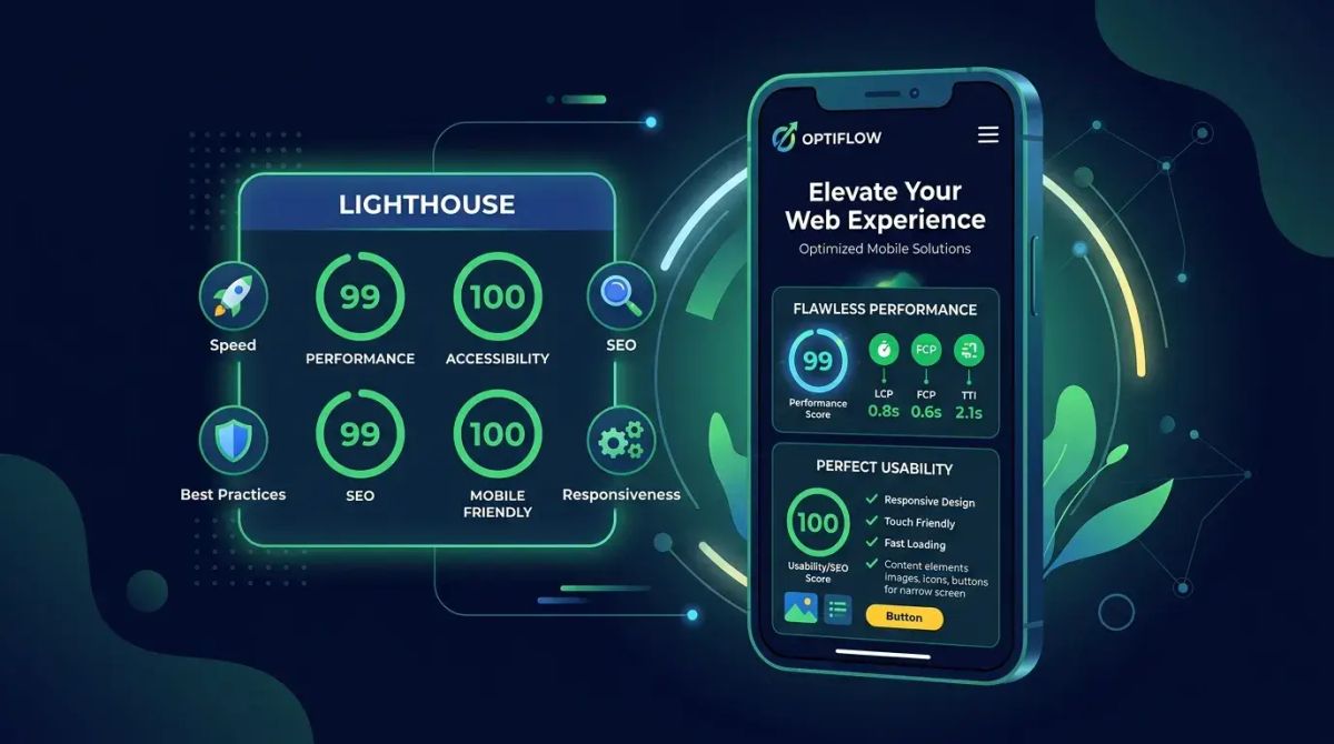
How can I test my mobile page speed?
Several tools and methods are available. Google PageSpeed Insights evaluates your mobile performance using Core Web Vitals metrics. The Lighthouse tab in Chrome DevTools provides detailed mobile performance analysis. WebPageTest lets you simulate different mobile device and network conditions. Google Search Console's Core Web Vitals report shows performance based on real user data. SEOctopus's mobile performance analysis tool brings all this data together in a single dashboard with continuous monitoring and alerting.
Does PWA have a direct impact on SEO?
PWA does not function as a direct ranking factor, but it can significantly impact your SEO success indirectly. The fast loading times PWA provides improve Core Web Vitals performance, offline functionality strengthens user experience, and push notifications increase repeat visit rates. All these factors indirectly influence search ranking signals positively. The important thing is to ensure PWA content is indexable by search engines.